
- DAU Stories
- UI Design Thoughts
- UI Design Issues
- ---
- UI Design Blinks 2013
- UI Design Blinks 2012
- UI Design Blinks 2011
- UI Design Blinks 2010
UI Design Blinks 2011
By Gerd Waloszek
 Welcome
to this column of brief, blog-like articles about various UI design topics – inspired
by my daily work, conference visits, books, or just everyday life experiences.
Welcome
to this column of brief, blog-like articles about various UI design topics – inspired
by my daily work, conference visits, books, or just everyday life experiences.
As in a blog roll, the articles are listed in reverse chronological order.
See also the overviews of UI Design Blinks from others years: 2010, 2012, 2013.
November 29, 2011: Bike Speedometers and Some Worst-Case Use Cases (or Scenarios)
For quite a while now, SAP User Experience has been promoting use cases as an indispensable tool for the UCD (user-centered design) process. Others favor less formal approaches, such as text- or sketch-based scenarios. Personally, I am fairly pragmatic as to which tool you choose – provided that you think about the people who use your software and the contexts in which they will use it.
Application: Bike Speedometers
The "standard" example of use cases in the literature is the automatic teller machine (ATM) – a hardware device, not a software application. This tells us that use cases and scenarios can be applied more generally than just to software applications. Here, I will follow that vein and look for them in the realm of bike speedometers (or bike computers, as some say...). I will investigate whether the designers of these devices really had all the possible worst cases in mind that can happen to a "dumb" user like me.
A Plethora of Worst Cases: Changing the Battery
The worst case scenario, or better, plethora of worst-case scenarios that I would like to discuss here goes as follows: You need to change the battery in your bike speedometer because it is weak or flat. This sounds fairly easy, but there are some caveats to bear in mind. Bike speedometers store a variety of useful data such as the wheel circumference (or equivalent), which is needed to display the correct speed, and – very important for me – the total distance traveled. So, my anxious question is: What happens to this data when I change the battery (or even before...)?
The ideal use case would be that you change the speedometer's battery in good time as soon as you realize that it is getting weak. You need to be fast, though, because if you do not fit the new battery within 15 seconds of removing the old one (the time span may vary – I found this number on the Internet), you lose all the data. If you are fast enough, most of the data is retained, including the wheel circumference and the all-important total distance.
But how do I know from that I have to be fast when changing the battery? From my own experience, common sense, other people, or even the manual? I have to admit that I rarely consult my speedometer manual. Most people lost the manuals anyway, or store them away some place where they can no longer find them. Luckily, I can download a PDF copy of the manual from the Internet, so I have no excuse for not having one at hand. But, despite scouring the manual, I cannot find any mention of the time span within which I have to change the battery to avoid losing data. That's why I ended up consulting the Internet.
I also have to admit that I regularly create conditions in which the time that elapses between realizing that the battery needs replacing and actually fitting a new one in place is far too long for any data to be saved. Either I simply forget that the battery is getting flat and let it run dry completely. Or I realize it is getting flat, but forget to buy a new one in time – with the same results. Or it takes more than 15 seconds to change the battery. And, of course, I always forget to write down the speedometer data before I change the battery – just in case I'm not fast enough... Regrettably, this is how human beings "work", and there can't be many examples of this species who write down the data before they remove the battery...

Figure: My bike computer – it looks a little scratched because of the worst-case scenario described below
Worst Case à la Loriot
In his sketches, the German humorist Loriot often drops things in seemingly stupid ways. Initially, I found this largely exaggerated and ridiculous. However, the older I get, the more realistic these scenes appear to me. Some time ago, when I was removing the speedometer from my bike, it leapt out of my hand, soared through the air, and crashed onto rocky ground. The lid securing the battery fell off and the battery jumped out of the device. All the data was deleted. I had not recorded it. Why should I? So the information of how many kilometers I had ridden had vanished for ever. This data was particularly important to me, because I wanted to estimate the positive carbon impact of my wonderfully sustainable commuting behavior. Sadly, the realities of life do not take such things into account. And, of course, I also had to consult the manual again to find the right wheel circumference…
Conclusions
Can we as designers learn any lessons from this? I think so. One lesson (an obvious one) is that there is probably going to be at least one worst case that you haven't catered for. Another, less trivial lesson, is that there are certain measures you can take to cope with the worst-case scenarios that you are not aware of. In the case of the bike speedometer, engineers could use solid-state memory that does not require electricity to store data or that stores it for at least a couple of weeks. This technology would, on the one hand, protect users from a lot of issues. On the other hand, it would increase the price of bike speedometers, which is the primary argument for dispensing with it. Once again, we encounter a prominent and ubiquitous question of balance for designers – cost versus user needs. And, last but not least, it is the human aspect and unpredictability – not so much technology – that makes design challenging and interesting – at least for me.
November 16, 2011: Technology Serves People???
In a blog entry in 2007 (the blog is called "bokardo"), Joshua Porter describes five design principles, one of which is: "Technology serves humans. Humans do not serve technology." This principle is only one of many variations of a general theme concerning the relationship between technology and people. Actually, I would rather phrase it as "technology should serve people" or "technology is there to serve people".
Twice a year, however, I feel that the principle is only partially true at best – when we put our clocks forward in March and back in late October. Changing my clocks just a few weeks ago inspired me to write this UI Design Blink. The time switches force us to reset our many, many clocks that linger around in our homes. And we have to adjust not only the real clocks, but also the clocks that are built into nearly every electronic device that we own.

Figure 1: Real clocks and clocks in devices like cameras, radio receivers, fax machines, and the car – all from my own household
Me and the Time Switch
First, there are the real clocks that have to be taken care of or "served" in the words of the principle above. If you modernized your clocks and have only radio controlled ones in your home you are lucky because these clocks take care of the time switch themselves. Here we find that technology does indeed serve people. Then there are the many analog clocks, which are not radio controlled. Here you can move the hands "by hand" or turn a wheel to move them, which is fairly easy to do, but needs your attention. But then there are the many purely digital clocks, which are controlled by a quartz crystal or by net frequency. Each of these has to be set to the new time, and the setting is different for every one. You are well advised to have all the manuals at hand.

Figure 2: More clocks from my household...
There are few things that irritate me more than a number of clocks displaying different times. This is frustrating enough if they differ by minutes. But it can seriously confuse me if some of them are one hour off – which one is right? So, in order to avoid confusion, I have to set at least all of the clocks that are readily visible to me. And this means, I have to do it for the stove, the radio receiver, the fax, the car (by the way, I never understood why clocks in cars cannot be radio controlled), the bicycle (speedometer), and many more... And my misery continues: There are so many built-in clocks in electronic and household devices that I am not even aware of some of them. Sometimes I stumble across a wrongly set clock weeks or even months after the time switch because it was not on my mental list of clocks to change. My digital camera is such an example.
Figure 3: Even more clocks from my household – note that the collection presented here is far from complete
But is this hassle really appropriate in the 21st century? Nowadays, most digital clocks are small computers. There is no reason why they cannot be programmed to take care of the switch between summer and winter time temselves. I know that there are regional differences in the USA concerning the date on which the switch is made, but as far as I know it's the same date all over Europe. But even if it is too difficult for engineers to program clocks tochange automatically, there should be a simple work-around: Why not add a switch or button that allows you to switch between summer and winter times? This would at least save people from searching for manuals and from complicated setting procedures. I know, of course, the counter-argument: This would make the devices cost about 50cts more. Terrorizing users seems to be less expensive – at least for the manufacturers of clocks and devices that include clocks – than letting zillions of people laboriously engage in setting their clocks and the clocks in their devices.
Conclusions
What does this story tell us about the relationship between technology and people? Technology can serve people if designers, developers, engineers, and marketing and business people understand human needs and simplify their lives – as is the case with radio controlled clocks. But it does not serve people if they focus on cheap and "insular" solutions like quartz clocks in cars and electronic devices – which might be programmed to take care of the time switch as well, or at least might offer an easier way of switching between summer and winter time. And while Joshua Porter leaves it at the remark that "too often people blame themselves for the shortcomings of technology", I am way beyond that: I am absolutely annoyed about the shortcomings of technology when it comes to adjusting clocks.
P. S.: Read also my UI Design Blink "March 30, 2011: Enriching and Not-So-Enriching Complexity".
P. S. 2: My photos show 25 clocks and clocks in devices (in the meantime, I found 30 clocks, see the two updates below). I do not know how many we really own. When I discussed this with my wife, she pointed out that there are many more clocks in our household that are not used (and therefore need not bother me...).
P. S. 3: This nice clock, a present from Japan (and currently not working), did not make it into my collection of clocks above – so here it is:
P. S. 4 (Dec, 6, 2011): I found four more clocks in my household:

References
- Joshua Porter ("bokardo" blog): Five Principles to Design By ("Technology serves humans. Humans do not serve technology" is the first of five design principles)
- Catriona Cornett ("inspireUX" blog): Blog entry from 2009 about Joshua Porter's principle "Technology serves humans. Humans do not serve technology" (this is how I found Joshua Porter's blog)
- UI Design Blinks, March 30, 2011: Enriching and Not-So-Enriching Complexity
October 18, 2011: Processing "pour l'art"!
In a number of UI Design Blinks published last year, I reported on my experiments with Processing, a Java-based programming language for designers. At that time, I had used it to create chart types that were not available in Microsoft Excel or, as I found out in the course of my experiments, would have been available if I had rearranged the data appropriately. This time, I would like to report on another type of experiment, namely "re-creating" computer art. My story goes like this.
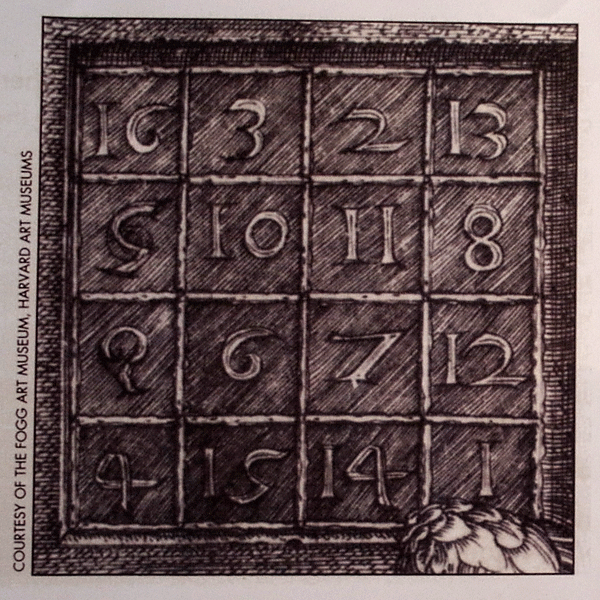
Yesterday, I attended the vernissage of a new art exhibition in the SAP training center. The new exhibition features Vera Molnar, a pioneer in digital or computer art. Born in Hungary in 1924, she moved to Paris in the late 1940s and later became a lecturer at the Sorbonne University. Molnar started her pioneering work in the late 1960s, initially using her brain as a "simulated computer" (machine imaginaire) to execute algorithms that she had developed. Since 1968 she has been using real computers and plotters. Regrettably, due to her advanced years, Vera Molnar was unable to take part in the vernissage. The exhibition presents a number of prototypical works of Molnar's, including variations on the magic square (a square of 4x4 cells that is filled with numbers that add up to 34 in each direction – which maybe explains why some models of the VW Beetle had 34 horsepower...) (see Figure 2). These were inspired by an etching by Albrecht Dürer (see Figure 1), a well-known German artist from the Middle Ages. Molnar's work is based on the subtle balance between the principles of order and chance (or disorder). Another of her principles is the systematic variation of certain parameters, such as the form or degree of randomness. I will reveal one more of her principles at the end of this blink.
 |
 |
Figures 1-2: Albrecht Dürer's magic square, in which vertical, horizontal, and diagonal cells add up to 34 (left); some of Molnar's variations of the magic square created with threads and nails (right). Click images for larger versions.
My niece accompanied us to the vernissage and, while studying the various works, we engaged in the typical discussions about abstract art: "Could one create such a work on one's own?", and: "Is it really art?" When we encountered the following work (see Figure 3), I decided that I would at least try and see whether I could "re-create" its spirit:

Figure 3: Digital art by Vera Molnar – two variations of the same random pattern (click image for larger version)
Back home, I switched on my laptop and started Processing. Luckily, I still had the programs that I had used the previous year to create bubble charts. I decided that a program of this kind would be a good starting point for my attempts. To cut a long story short: After about an hour (and a major struggle with the programming language – due to my lack of familiarity with it), I ended up with the following results (see Figures 4 and 5):
 |
 |
Figures 4-5: Digital "art" inspired by Vera Molnar – two variations of the same random pattern programmed with Processing (click images for larger versions)
I presented the results to my niece and my wife, and both agreed that I had successfully captured the "spirit" of Molnar's original work, including the visual perceptual effects that the "egg" version, in particular, elicited. Finally though, one question remains: Did I produce art? Of course, I didn't! And I say this for several reasons. Firstly, it was not an original idea of my own that I had implemented and, secondly, it was more or less my first (and last) attempt at this endeavor. Vera Molnar, on the other hand, creates myriads of variations on one idea and only selects the ones that really look "interesting" to her. And this leads me to the above-mentioned additional principle, namely "selection". Order is provided by arranging the "eggs" regularly in a grid; random variation refers to the random orientation of the "eggs"; systematic variation of parameters creates a huge space of results to select from and, finally, selection decides what is art and what isn't.
By the way: As my example demonstrates, it is much easier to copy or even fake digital art than traditional art...
References
- Vera Molnar (Philip Galanter)
- Vera Molnar's Website
- Casey Reas & Ben Fry (2007). Processing: A Programming Handbook for Visual Designers and Artists. The MIT Press, 2007 • ISBN-10: 0262182629, ISBN-13: 978-0262182621 • Review
- Processing Website
October 12, 2011: A Matter of (Visual) Perception...
Just before I went on my summer vacation, SAP Corporate Portal received a facelift. Before I left, I was able to check briefly that there were no severe issues with our Portal pages. Of course, I would need to perform more careful checks once I was back in the office. Among other things, the redesign included changes to the third-level navigation on the left and the teasers on the right: Both columns now have a white background, and various elements such as header bars, selections, and separator lines appear in different shades of gray (see Figures 1 and 2 below). Therefore, I changed the background and header bar colors of our manually-created teasers accordingly – the navigation is out of my scope – and also applied the respective changes to further internal SAP UX sites that mimic the Portal's look.
So far, so good. However, when I looked at the Portal's homepage a week later (see Figure 1 again), I was somewhat puzzled. It seemed to me as if both the navigation and the teasers had a very, very light gray background. I was aware of the fact that the Portal team sometimes introduces slight changes to the design to improve it, and I assumed that just this had happened. "Perhaps they wanted to separate the content area more clearly from the navigation and the teasers," I thought. And then I said to myself: "Oh dear, now I will have to apply those changes to my teasers and all our internal SAP UX Websites as well!" To be able to do this, I had to find out what the new color values of the backgrounds were. So I made a screenshot of the Portal's homepage and started Photoshop.
Because Photoshop's startup took quite a while on my computer, I moved to the SAP UX homepage on the Portal to check how it would look with the new backgrounds (see Figure 2 again). And indeed, the left and right columns appeared to have the same faintly gray background like the portal homepage – perhaps even more pronounced in the navigation column. I paused for a moment... Why could that be the case? I had set the background color of our teasers to white, and the Portal team would not have touched this. In the meantime, Photoshop was ready, so I pasted the screenshot into a new image file. Then the "moment of truth" came: I selected the eyedropper tool and checked the background colors of both the left and right column. And guess what color values I got for the two columns!" #FFFFFF", which is "white", of course.
What had happened? I had fallen for a visual effect (or illusion) that I myself had described some years ago for the SAP Design Guild: brightness assimilation. Brightness assimilation basically means that the brightness of certain areas moves in the direction of the brightness of surrounding areas – the areas become more similar. In my case, the white background appeared as light gray because the header bars, selection background, and divider lines were gray. By the way, the opposite effect of assimilation is called brightness contrast; it moves the brightness of neighboring areas in the direction of more extreme values.
 |
 |
Figures 1-2: Brightness assimilation on SAP Corporate Portal (homepage and UX homepage) (click the images for anonymized sections of the screens to – hopefully – see the effect more clearly)
There are corresponding effects for color: Color assimilation (also known as the Von Bezold spreading effect or Bezold-Brücke effect) means that colors take on the hue of the surrounding color. It is the opposite of color contrast, which moves colors in the direction of their complementary colors. Figure 3 below shows an animated example of color assimilation that I created years ago for the SAP Design Guild color glossary:

Figure 3: Animated example of color assimilation
All in all, I have learned from this incident that designers should have some basic knowledge of human visual perception so as to avoid unnecessary work – and this knowledge should not be hidden too deeply at the backs of their brains.
References
- Color Glossary (see keywords: Brightness Assimilation, Color Assimilation)
- Optical Illusions (see Phenomena of Contrast)
August 11, 2011: Don't Take My 4:3 Monitor Away from Me – or Perhaps You Can? Looking at the Options for Portrait Monitors, and My Conclusions
In three UI Design Blinks, I discuss whether I should fight for my trusty old 4:3 monitor or move over to a current 16:9 full-HD, wide-screen monitor. As I have already outlined, a portrait monitor would be an interesting option for my workplace, too. As a first step, I investigated and reported in a previous UI Design Blink whether modern pivot LCD monitors (pivot monitors can be rotated by 90 degrees) exhibit the same drawbacks I experienced several years ago. I found that in modern monitors, orientation effects caused by the microstructure of the LDC pixels cells are only minor and acceptable. In this, my final UI Design Blink on this subject, I move to the second step and present the results of tests that were geared to my own use cases at work and conducted with monitors of different aspect ratios in portrait mode.And finally, I present my conclusions. ...
Wide-Screen and 4:3 Monitors in Portrait Mode – Introduction
"Operationalizing" my own use cases, I investigated the following questions: How do Web pages, Word documents in page view, HTML documents in Dreamweaver, and the Photoshop Elements screen look on portrait monitors of different aspect ratios? I included the following monitor types in my investigations (see also Figures 1-3):
- A new 16:9 wide-screen pivot monitor (Windows 7)
- A new 16:9 wide-screen monitor (Mac OS X 10.7)
- A several-year old 16:10 wide-screen monitor (Mac OS X 10.7)
- A 4:3 pivot monitor that is also several years old (Windows 7)
Figures 1 to 3 show three of the monitors that I used in my investigations at work and at home. While the 16:9 monitors in portrait mode are too narrow for my taste, the 4:3 (or 16:12) monitor's dimensions appear more harmoniously.
 |
 |
 |
Figures 1-3: A 16:9 pivot monitor (left) and 4:3 pivot monitor (center) in portrait position (both at work). Right: 16:9 monitor in "simulated" portrait mode (at home)
My tests involved the following scenarios:
- A Web page overloaded with text (SAP Design Guild)
- A Word document in page layout and in full-screen view
- A Dreamweaver editor screen
- A Photoshop Elements editor screen
I did not investigate each possible combination for technical reasons (for the initiated: this is not a complete test plan!) and because this was a fun project, not research.
The Results (1): Word
In the following, I present some of my results for a Word document in page layout and full screen view:
16:9 Monitor (1920 x 1080, Wind. 7) |
16:10 Monitor (1920 x 1200, Mac OS X) |
4:3 Monitor (1600 x 1200, Windows 7) |
||
 |
 |
|
||
Page layout view at 110% |
Page layout view at 150%* |
Page layout view at 110% |
||
 |
 |
 |
||
Full screen view |
Full screen view at 200%* |
Full screen view |

Figures 4-9: Word document in page layout (top row) and full screen view (bottom row) for various monitors in portrait mode
*) 110% is the default magnification of page layout view on the Mac, too, but it is too small for easy reading. On the Mac, the default magnification for full screen view is too low. Perhaps, the size differences are due to the different dpi values used by the Mac (72 dpi) and by Windows (96 dpi).
Note: As I have already mentioned in the previous UI Design Blink, 16:10 monitors are recommended for displaying a single A4 page in portrait mode. However, it cannot be the pixel count that led to this recommendation, because I found out in the meantime that early full page monitors offered only 870 x 640 pixels (which is sufficient for a screen resolution of 72 dpi). The recommendation was probably based on the aspect ratio, which is 14.1:10 or 12.7:9 for an A4 page (which has an aspect ratio of the square root of 2). Therefore, on a 16:9 monitor in portrait mode you see considerably more than one print page (and, in return, the page content is smaller than on 16:10 monitors).
Conclusions
All in all, a 4:3 monitor makes the best use of screen space for displaying a single print page. The 16:10 monitor only comes in second – despite being the recommended option...
Two-Page Display
4:3 Monitor (1600 x 1200, Windows 7) |
||
 |
||
 |
 |
|
Figures 10-12: 4:3 monitor (1600 x 1200 pixels) – Word document in layout mode (top left) and in full screen mode (bottom left and right) (Windows 7)
I expected my 4:3 monitor in landscape mode to be ideal for viewing two print pages in parallel, and this is indeed the case. With its relatively low pixel count of 1600 x 1200 pixels, however, magnification in page layout view is reduced to about 85% (see Figure 10; the maximum magnification, which shows two pages, is 90%). The magnification in full page view is unknown to me (Figure 11). However, there is a setting that shows how the page will look as printed. It makes the page a little bit smaller and might correspond to 100% magnification (Figure 12).
Conclusions
Now I have found two good reasons to fight for keeping my 4:3 monitor...
The Results (2): Web Page
Furthermore, I investigated how a SAP Design Guild Web page showing a lengthy conference report with several images would look on the various monitors in portrait mode:
16:9 Monitor (1920 x 1080, Wind. 7) |
16:10 Monitor (1920 x 1200, Mac OS X) |
4:3 Monitor (1600 x 1200, Windows 7) |
||
 |

|
 |
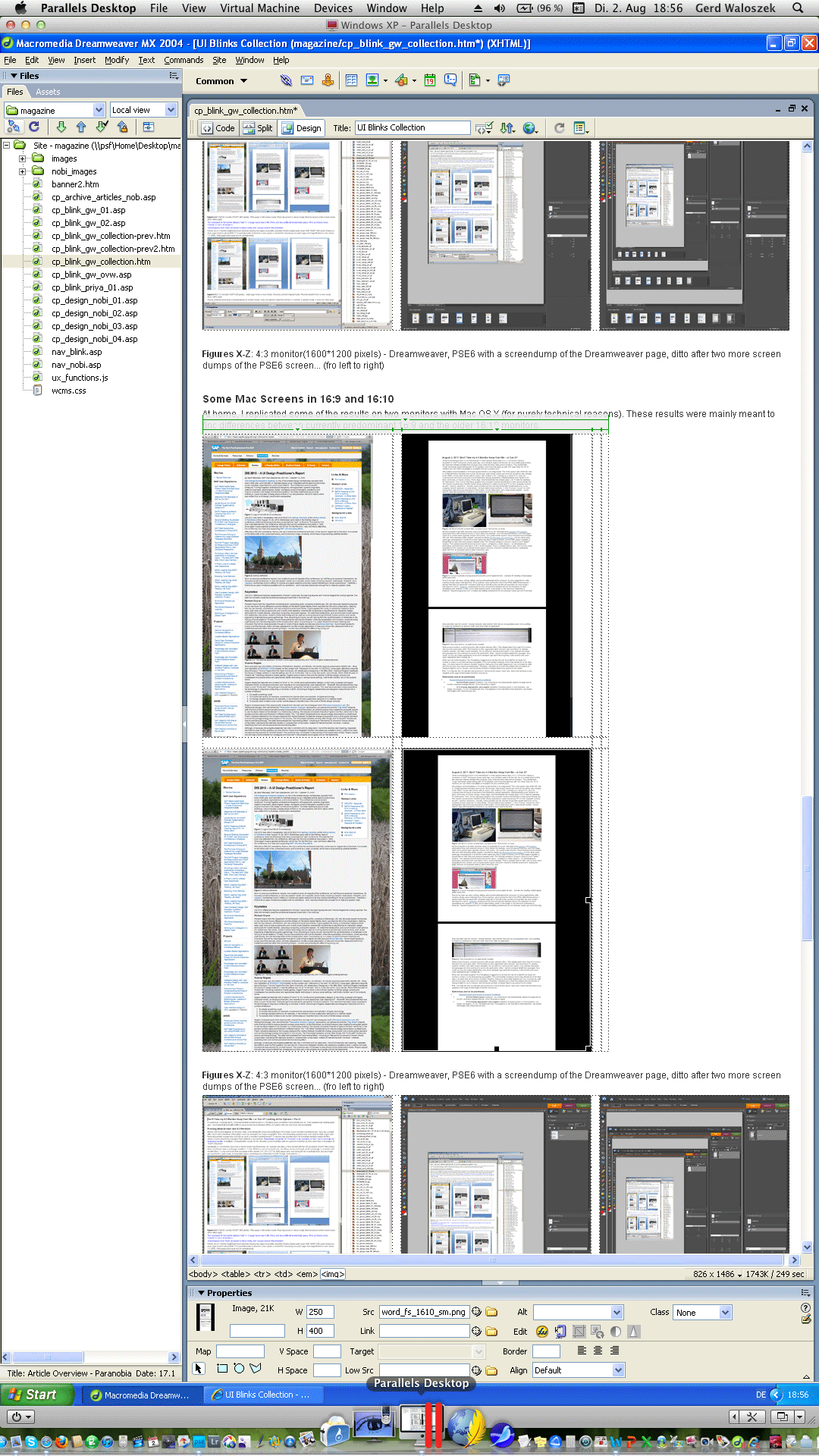
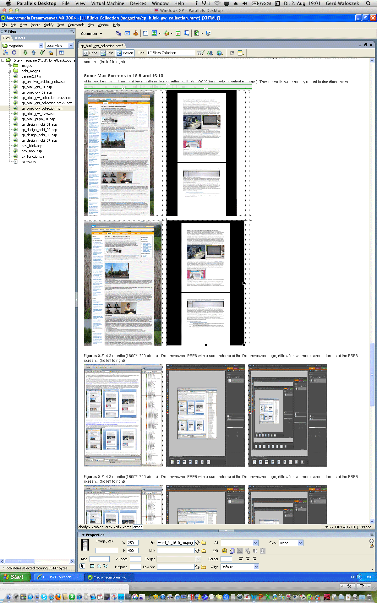
Figures 13-15: A Web page displayed on several monitors in portrait mode - left: 16:9 monitor (1920 x 1080), center: 16:10 monitor (1920 x 1200), right: 4:3 monitor (1600 x 1200)
Conclusions
Web pages look unusually tall on 16:9 monitors in portrait mode, but one might get used to this, particularly for long Web pages that contain a lot of text like my SAP Design Guild articles ;). 16:10 monitors look a little bit better to me, but as the width of the SAP Design Guild Web pages is fixed, these do not profit from wider screens. Personally, however, I prefer viewing Web pages on a 4:3 monitor in portrait mode, probably because its dimensions come closest to a book page.
The Results (3): Dreamweaver and Photoshop
Finally, I investigated whether working with Photoshop Elements and Dreamweaver in editor mode might profit from portrait monitors:
16:9 Monitor (1920 x 1080, Mac OS X) |
16:10 Monitor (1920 x 1200, Mac OS X) |
4:3 Monitor (1600 x 1200, Windows 7) |
||
 |
 |
 |
||
 |
 |
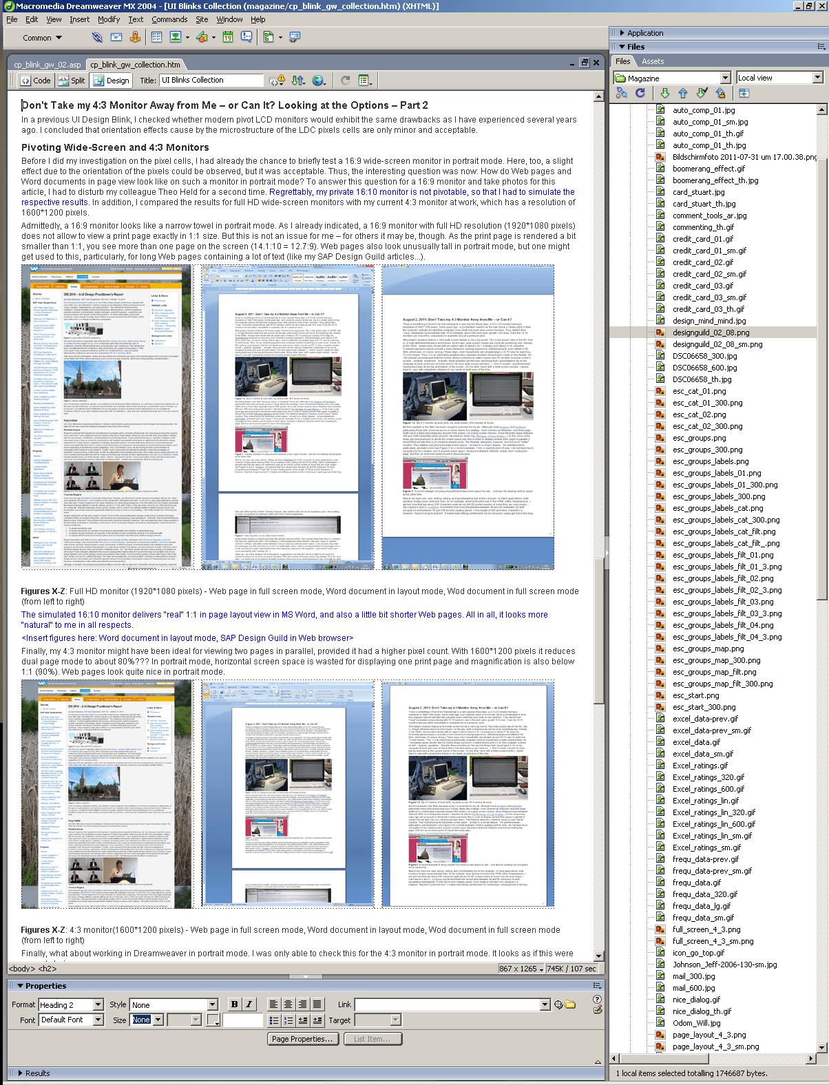 |
Figures 16-21: Adobe Photoshop Elements screens (top) and Dreamweaver screens (bottom) on various portrait monitors
Conclusions
Using a portrait monitor for image processing does not look promising to me, because I rarely process images in portrait format (see Figures 16-18). The only exception might be if I need to display a large number of images in the project area at the bottom. But then you also need to have a lot of RAM installed on your computer for this.
For Dreamweaver, the portrait mode makes more sense to me, but I cannot offer any long-term experiences at the moment. Here, too, the 4:3 monitor in portrait mode seems to be the best choice to me.
Some Personal Impressions
As I have already stated, a 16:9 monitor in portrait mode looks too narrow to me. A 16:10 or 4:3 monitor in portrait mode appears more "natural". Maybe, this is due to the horizontal-vertical illusion, which makes humans overestimate vertical distances. Moreover, a 4:3 monitor in portrait mode comes closest to the format of a print page, although usually the 16:10 format is recommended for one-page monitors.
Both Windows 7 and Mac OX 10.7, allow you to adapt the screen content to the monitor's orientation in the control panel for the monitors. This was definitely a nice discovery that I made during my investigations. However, having to change the monitor's orientation according to the current needs is cumbersome. It would be better if that the monitor driver could detect orientation changes automatically.
Wide large monitors introduce additional issues: When using my large monitor (23", 16:10) at home, I have to turn my head if I want to see the whole screen. I find this uncomfortable. The same holds true for full-HD wide-screen monitors (and possibly 1920 x 1200 wide-screen monitors, too) in the vertical dimension: I have to move my head up and down when trying to see the entire screen. I also often lose the cursor position when working with a 16:9 screen in portrait mode.
And, having worked a little bit longer with my 4:3 monitor in portrait mode now, the horizontal stripes introduced by the microstructure of the LCD pixel cells have begun to disturb me a little.
Summary Conclusions
All in all, if my current 4:3 monitor is replaced with a 16:9 wide screen one, this will not turn out to be the disaster that I had expected. But – much to my surprise – my investigations revealed that a 4:3 monitor would, in both portrait and in landscape mode, be the best choice for my use cases at work. Even a 16:10 monitor would be a better choice for me than a 16:9 monitor. Thus, it looks as if I will indeed have to fight for keeping my trusted old 4:3 monitor on my desk.
Afterthought: What Can Software Designers Do?
As this UI Design Blink has already far exceeded its permissible length, I will only briefly mention that there is also a design aspect to the use of wide-screen monitors. Many software applications, including the ones that I am using like Photoshop Elements and Dreamweaver, already employ a tiled approach. However, in their current design they still do not make optimal use of wide screens. One example that I know of to make better use of wide screens, is the new Apple Mail application, which was introduced with the Lion version of the Macintosh operating system. Now it sports three columns in order to make better use of wide screens.
 |
 |
Figure 22-23: Adobe Photoshop Elements 9 uses a tiled approach but does not make optimal use of wide screens; the new Apple Mail has been redesigned to better accommodate wide screens (both screenshots on a full HD wide screen)
A quick look at MS Outlook revealed that it can also be configured to show three columns (note that the left column is tiled and does not scroll as a whole):
Figure 24: Three columns in MS Outlook (on a laptop with 4:3 screen)
Finally, I would like to return to my article, The Blessings of Large Displays..., in which I talk about "triptychon" layouts. Somewhere else, I also considered triptychon screens – screens that are foldable like the real triptychons. Here, I would like to propose to turn wide screens into "virtual triptychons" (we might also add "diptychons" to the collection). Users might configure the virtual screens, that is, the number of columns (two or three), their width, and also whether columns can be scrolled independently. The latter functionality would, for example, allow for easy comparison of text passages or enable scrolling the central content part of the screen, while the tools on the screens to the left and right retain their positions.
However, independent scrolling of columns can also be realized within applications, as Apple Mail demonstrates. Thus, for me, it is still an open question as to which is the better solution: providing columns (1) on an application basis or (2) "hard-wired" on operation system basis (which would require that applications be adapted to this feature). This is definitely enough stuff for a new article at some point in the future.
References
- Advantages of Portrait and Pivoting Monitors for Desktop Publishing (About.com)
- The Blessings of Large Displays... (SAP Design Guild)
August 10, 2011: What Is a Usability Issue?
At a recent team meeting, my colleague Theo Held reported on his visit at the UPA International 2011 conference in Atlanta, GA, where he had attended an interesting panel discussion led by Rolf Molich from dialogdesign in Denmark. For years, Molich has been tirelessly demonstrating that certain usability beliefs are myths, including the famous Nielsen/Landauer statement that "five test persons are enough for finding 80% of all usability issues". In his Atlanta panel, entitled "The Evaluator Effect Revisited (CUE-9)", Molich demonstrated that when usability experts watch the same usability test sessions and write reports about their findings, depending on the evaluator, the number, type, priority, and severity of findings will be extremely variable. Theo remarked that even opinions on successful completion were highly controversial. Consequently, during the presentation of the results, a lively discussion about the nature of example findings emerged. In this UI Design Blink, however, I do not intend to join the discussion and add another opinion. Instead, I want to write about one of the test examples because it rang a bell for me: It reminded me of an editorial, entitled Usability Levels – Three Ways to Care for Usability, which I had written 10 years ago for the SAP Design Guild Website. This is the Web page of the test example, which I would ask you to take a brief look at and think about possible issues with the page before you continue with reading:

Figure 1: Example screen that lead to a controversial discussion during the panel
While Molich and some American panel participants found a severe usability issue on this page, other participants did not. Theo gave us the chance to find issues, but nobody detected any – overall, the page looked OK to us. Indeed, if the page had been in a language that we did not understand, there would have been no other choice. I can conclude that the page passes a "syntactic" usability test (10 years ago, I called this the "style guide level"). However, even though the page was in English, which we do understand, we might still not have found find issues with it because we are not subject matter experts – as our brief test at the meeting and the controversial discussion at the panel show.
The real usability issue with this page is that the option recommended offers a liability that is far too low, one that would not sufficiently cover any accidents caused during a move. The second option includes a sufficiently high liability and thus should be recommended instead, as Molich and some American panel participants insisted. By the way, I see another issue on the page, namely in the product naming: Calling the first choice "Safemove" despite its insufficient liability in fact misleads customers.
All in all, the page presented here demonstrates that there is another range of usability issues: issues that are content-related and therefore can only be identified by subject matter experts. To connect with my editorial, we might say that these issues are at the "semantic level" (there, I talked of the "user-and-task" level). This makes me, once again, skeptical about automated usability tests. These tests will only find "syntactic" errors, not "semantic" ones. They might be useful for mass tests, but they will never catch the more tricky usability issues. I feel obligated to warn those who believe that they can do with cheap and easy quality tests. UI and domain knowledge is still required for catching content-related usability issues in time to deliver logical applications to customers.
Perhaps my syntactic-semantic distinction (actually, this is not the first one in HCI history) hit on one of the reasons why these huge differences – even among usability experts – in Molich's studies exist. However, a UI Design Blink is not the right place to speculate about this.
References
- Molich's Website (English version) • CUE studies
- Fünf Mythen über Usability Testing (in German)
- Usability Levels – Three Ways to Care for Usability (SAP Design Guild)
August 9, 2011: Don't Take My 4:3 Monitor Away from Me – or Perhaps You Can? Checking the Feasibility of Portrait Monitors
In a previous UI Design Blink, I complained about wide-screen monitors, because they do not fit my use cases at work. But obviously there are no other choices these days. Initially, it seemed to me that all I could do was fight for my trusted 4:3 monitor to keep it on my desk as long as possible. A closer look, however, revealed that the case might merit reconsideration. Therefore, I will investigate this old issue of mine, in this UI Design Blink, using LDC screens in portrait mode.
A Brief History of Monitor Sizes...
I would like to start with a brief and simplified history of monitor sizes. For decades, computer users sat in front of monitors with an aspect ratio of 4:3. The only thing that seemed to change was the pixel count, which increased gradually over the years (VGA, XGA, XVGA, and so on...). About ten years ago, there was a sudden change: Vertical "one-page" monitors were introduced, which showed exactly one print page (or more precisely, one DIN A4 page). Obviously, these monitors were not widely adopted by users; they were also very expensive. Moreover, a pure one-page monitor is not a viable option for many users. I, for example, do a lot of image processing and therefore also need a monitor in landscape mode.
There were also so-called "two page" monitors, which allowed you to view two print pages in parallel. But as far as I can remember, these were just 4:3 screens with – at that time – a huge pixel count. (The ones I found on the Web were 10-year-old CRT monitors; an old Quatographic CRT monitor, for example, boasted of 2048 x 1536 pixels). Anyway, if you add the sizes of two DIN A4 pages, you get 42 x 30.5 cm, which is at least close to an aspect ration of 4:3. Therefore, all you need is a 4:3 monitor with a sufficiently high pixel count. I could not find any one-page monitors on the Web to determine their pixel count. It looks as if wide-screen monitors with an aspect ratio of 16:10 will do the job. (I found a recommendation to use a monitor with 1920 x 1200 in portrait mode. A pixel count of 1920 x 1080 does not seem to suffice for an 1:1 presentation of a print page.)
Soon after, pivot monitors entered the market, that is, monitors that allow users to rotate the screen 90 degrees and thus enable both portrait and landscape mode. These monitors were even more expensive and, thus, were likewise not a huge commercial success. But they are still on the market. At first, pivot monitors were poorly supported by operating systems. However, Windows 7 and Mac OX S 10.7 allow you to rotate the screen content manually and even create your own pivot monitor from an ordinary one (see my pivot monitor simulation below).
Therefore, my obvious choice would be to consider a portrait monitor for my work place. And alas, I am now reconsidering my past experiences...
Investigating the "Pivotability" of Current LCD Monitors
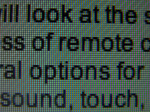
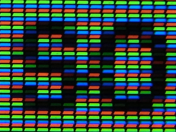
When I had a pivot LCD monitor on my desk several years ago, I encountered an unexpected issue: When I turned the monitor 90 degrees, the micro structure of the LCD screen (CRT monitors on Trinitron basis may have suffered from the same issue) made the text essentially unreadable in portrait orientation. So I dispensed with pivoting. This issue, however, seems to have become less severe in the meantime, because modern monitors have smaller pixels, which introduce fewer orientation artifacts. Here are my results from a recent LCD monitor without a pivot function – I just turned the text 90 degree to the right and also turned the monitor (or the camera).
 |
 |
Figures 1-2: Micro structure of a recent LCD screen with quadratic pixel cells. On the left, RGB pixels are oriented vertically (landscape mode), on the right, they are oriented horizontally (portrait mode)
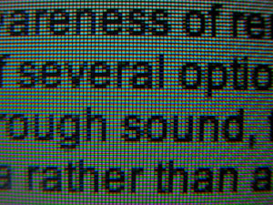
Figure 1 and 2 show the screen's micro structure consisting of quadratic pixel cells from a distance that is close enough to recognize the pixels. Figures 3 and 4 show the pixel cells in even more detail. (The detail photos do not provide an impression of whether the micro structure is disturbing or not.) Each quadratic cell consists of three rectangular pixels in the colors red, green and blue (RGB). On the left (Figures 1 and 3), RGB pixels are oriented vertically (the monitor is in landscape mode). On the right (Figures 2 and 4), they are oriented horizontally (the monitor is in portrait mode). Although there is still a slight "stripe effect" in portrait mode, I find it far less disturbing than the results on my old monitor.
 |
 |
Figures 3-4: Micro structure of a recent LCD screen with quadratic pixel cells enlarged
In the meantime, I had the chance to take a look a new 16:9 wide-screen monitor in portrait mode. Here, too, I observed a slight effect due to the orientation of the pixels, but it looked acceptable to me. I also checked the orientation effect on my 4:3 monitor at work, which is a few years old (Figures 5 and 6). The effect is again visible, but it does not disturb viewing (open the larger images to get rid of the moiré effects).
 |
 |
Figures 5-6: Micro structure of my 4:3 LCD screen at work with quadratic pixel cells. On the left, RGB pixels are oriented vertically (landscape mode), on the right, they are oriented horizontally (portrait mode). The moiré effect disappears in larger versions of the images (click images)
Conclusions
All in all, these results indicate that a current pivot monitor might be worth considering. Therefore, I will turn to more practical tests in a follow-up UI Design Blink, investigating Web pages, Word documents, and other applications with monitors of different aspect ratios in portrait mode.
Preview...
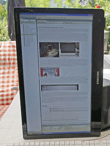
In part, I will have to simulate pivot monitors. Here is a preview showing how I simulate a 16:9 wide-screen monitor in portrait mode at home:
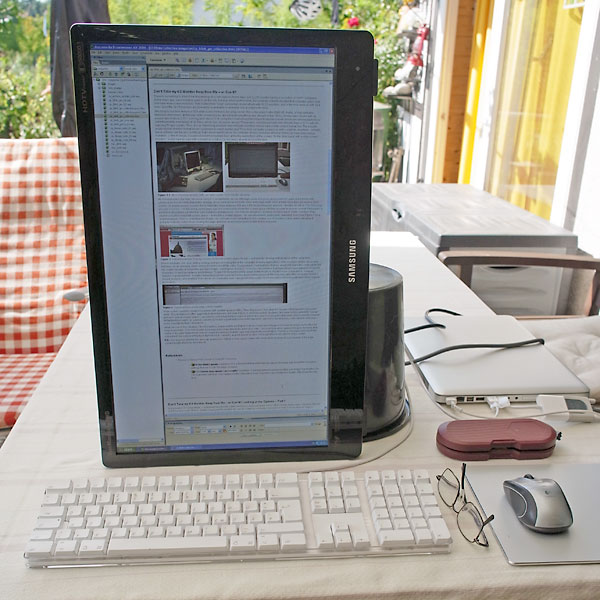 |
 |
Figures 7-8: Simulating a 16:9 portrait monitor at home (left: front view; right: back view)
August 9, 2011: Don't Take my 4:3 Monitor Away from Me – or Perhaps You Can?
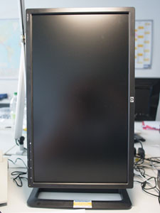
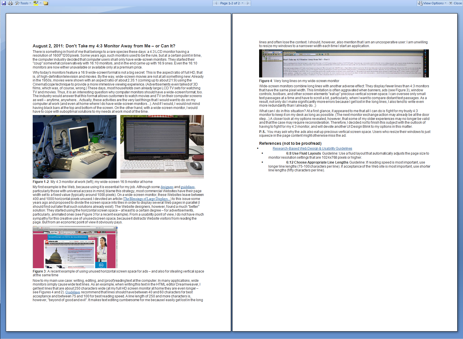
There is something in front of me that is a rare species these days: a 4:3 LCD monitor having a resolution of 1600 x 1200 pixels. Some years ago, such monitors used to be the rule, but at a certain point in time, the computer industry decided that computer users shall only have wide-screen monitors. They started their "coup" somewhat conservatively with 16:10 monitors, and in the end came up with 16:9 ones. Even the 16:10 monitors are now either unavailable or available only at a premium price.
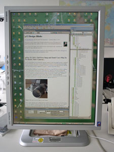
Why today's monitors feature a 16:9 wide-screen format is not a big secret: This is the aspect ratio of full HD, that is, of high-definition television and movies. By the way, wide-screen movies are nothing new at all: Back in the 1950s, movies were shown with an aspect ratio of about 2.35:1 (equivalent to about 21:9) using the CinemaScope technique to provide a more immersive viewing experience. (Advertisements even talked of 3D films, which was, of course, wrong.) These days, most households own large LCD TV sets for watching TV and movies. Thus, it is an interesting question why computer monitors should have a wide-screen format, too. The industry would say that this format allows customers to watch movies and TV on their computer screens as well – anytime, anywhere... Actually, these activities are the very last things that I would want to do on my computer at work (and even at home where I do have wide-screen monitors...). And even if I did, I would not mind having black bars at the top and bottom of the screen. On the other hand, with a wide-screen monitor, I would have to cope with suboptimal solutions to my needs at work most of the time.
 |
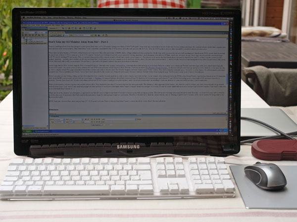 |
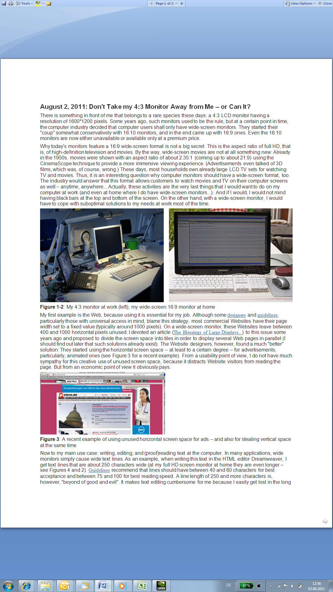
Figure 1-2: My 4:3 monitor at work (left); my wide-screen 16:9 monitor at home
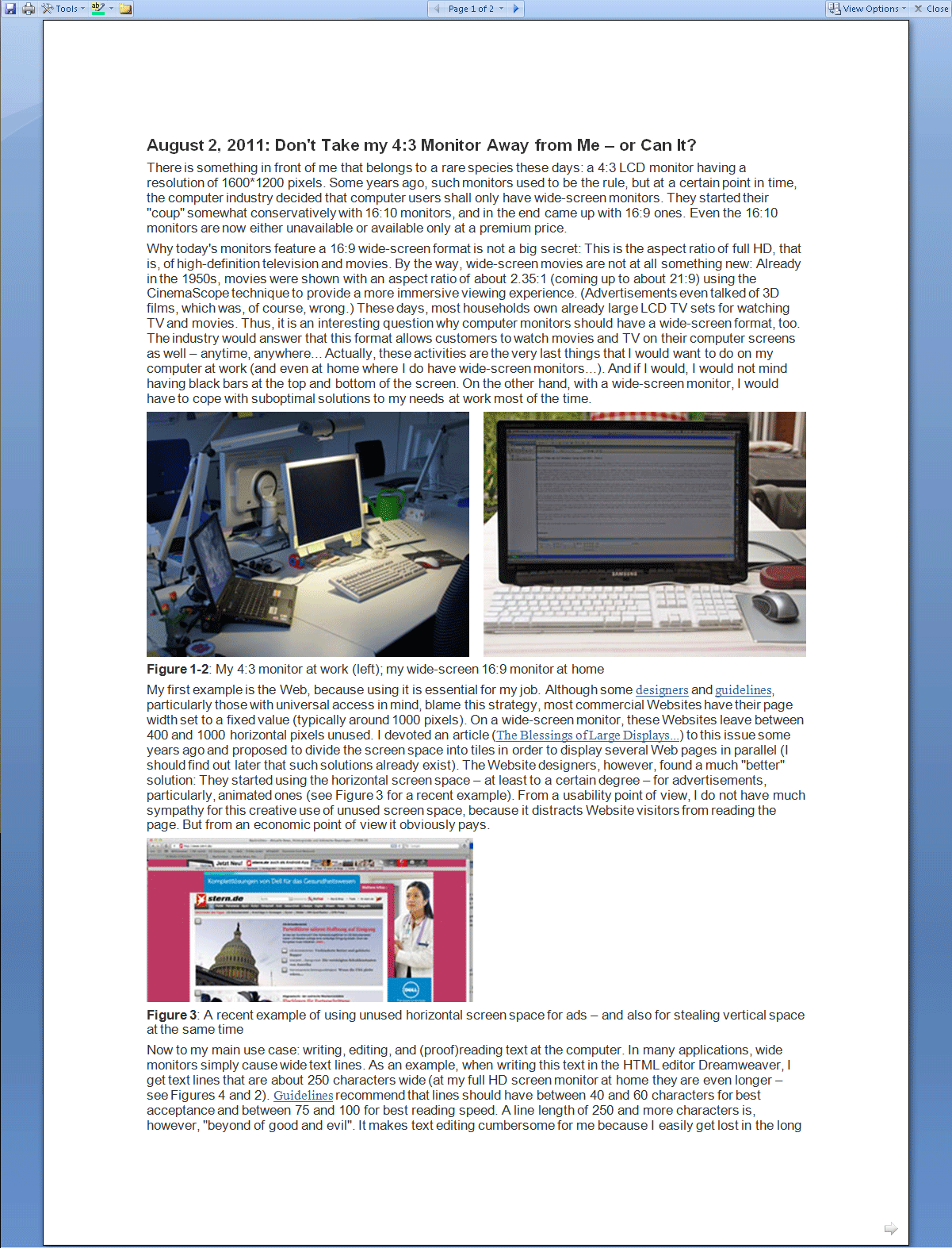
My first example is the Web, because using it is essential for my job. Although some designers and guidelines, particularly those with universal access in mind, blame this strategy, most commercial Websites have their page width set to a fixed value (typically around 1000 pixels). On a wide-screen monitor, these Websites leave between 400 and 1000 horizontal pixels unused. I devoted an article (The Blessings of Large Displays...) to this issue some years ago and proposed dividing the screen space into tiles in order to display several Web pages at once (only to find out later that such solutions already existed). Website designers, however, found a much "better" solution: They started using the horizontal screen space – at least to a certain degree – for advertisements, particularly, animated ones (see Figure 3 for a recent example). From a usability point of view, I do not have much sympathy for this creative use of unused screen space because it distracts Website visitors from reading the page. But from an economic point of view it obviously pays off.
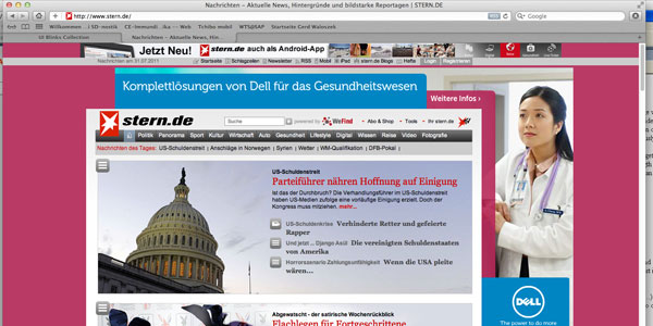
Figure 3: A recent example of using unused horizontal screen space for ads – and also for stealing vertical space at the same time
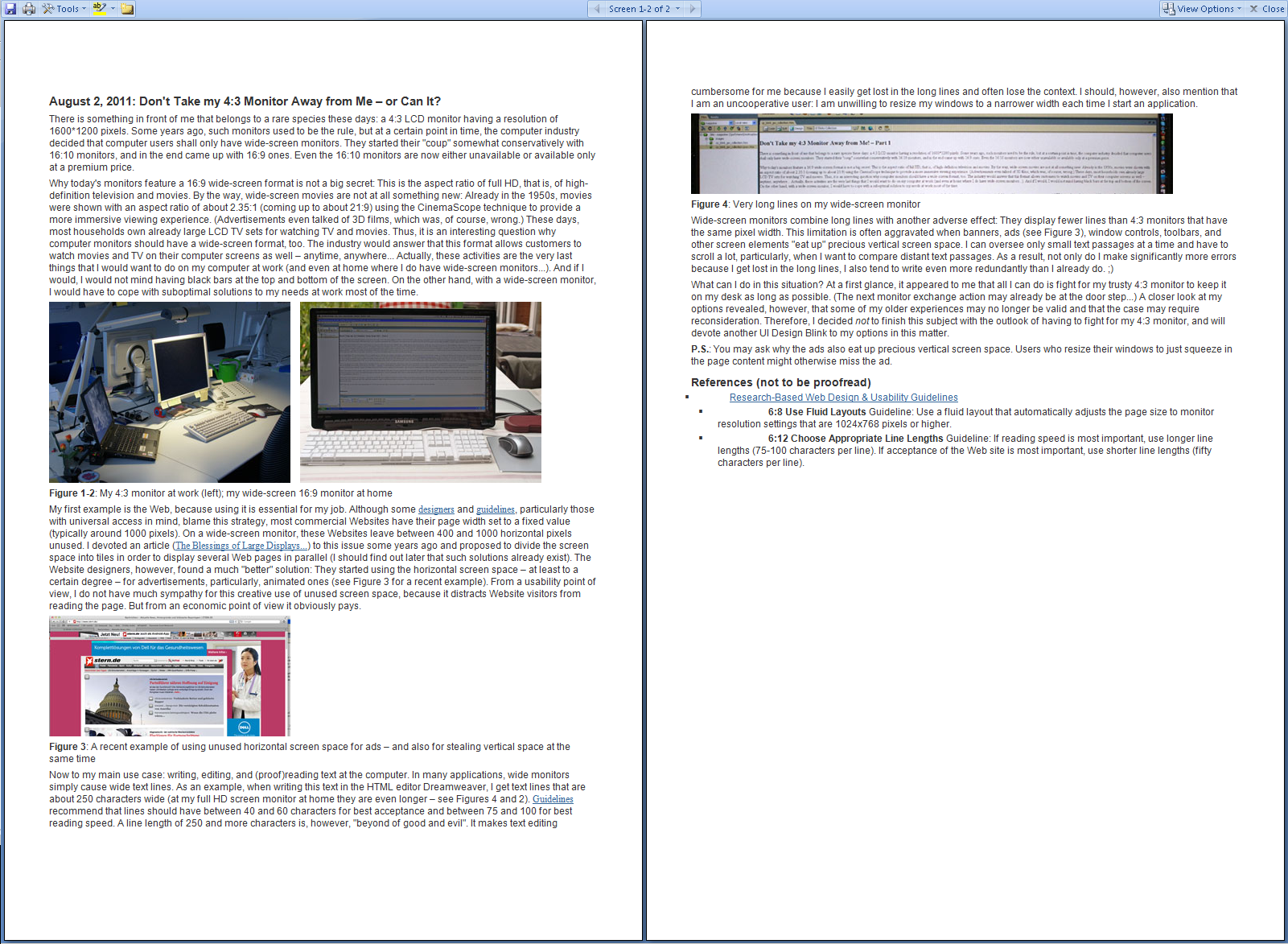
Now to my main use case: writing, editing, and (proof)reading text on the computer. In many applications, wide monitors simply cause wide text lines. As an example, when writing this text in the HTML editor Dreamweaver, I get text lines that are about 250 characters wide (on my full HD screen monitor at home they are even longer – see Figures 4 and 2). Guidelines recommend that lines should have between 40 and 60 characters for best acceptance and between 75 and 100 for best reading speed. A line length of 250 or more characters is clearly off the scale. It makes text editing cumbersome for me because I easily get lost in the long lines and often lose the context. I should, however, also mention that I am an uncooperative user: I am unwilling to resize my windows to a narrower width each time I start an application.

Figure 4: Very long lines on my wide-screen monitor
Wide-screen monitors combine long lines with another adverse effect: They display fewer lines than 4:3 monitors that have the same pixel width. This limitation is often aggravated when banners, ads (see Figure 3), window controls, toolbars, and other screen elements "eat up" precious vertical screen space. I can only focus on small text passages at a time, which means I have to scroll a lot, particularly when I want to compare text passages further down. As a result, not only do I make significantly more errors because I get lost in the long lines, I also tend to write even more redundantly than I already do. ;)
What can I do in this situation? At first glance, it appeared to me that all I can do is fight to keep my trusted 4:3 monitor on my desk for as long as possible. (The next monitor replacement action may already be just around the corner...) A closer look at my options revealed, however, that some of my older experiences may no longer be valid and that the case may require reconsideration. Therefore, I decided not to finish this subject with the prospect of having to fight for my 4:3 monitor, and will devote another UI Design Blink to my options on this matter.
P.S.: You may be wondering why the ads also eat up precious vertical screen space. This is because users who resize their windows to just squeeze in the page content might otherwise miss the ad.
References
- Research-Based
Web Design & Usability Guidelines
- 6:8 Use Fluid Layouts Guideline: Use a fluid layout that automatically adjusts the page size to monitor resolution settings that are 1024x768 pixels or higher.
- 6:12 Choose Appropriate Line Lengths Guideline: If reading speed is most important, use longer line lengths (75-100 characters per line). If acceptance of the Web site is most important, use shorter line lengths (fifty characters per line).
May 23, 2011: Full Press Snap and Dumb Users Who Do Not Know Their Cameras...
This UI Design Blink does not deal with computers. Instead, it deals with digital cameras, or digicams for short. However, since Alan Cooper's memorable presentations at SAP we all know that digital cameras are indeed computers. For example, they need some time to boot when turned on. And the issues that I will present here definitely also apply to computers and mobile devices.
My digicam Ricoh GXR has a special feature called full press snap (FPS) that can lead to confusion – this is what I want to write about here. The feature was suggested to Ricoh by a professional photographer who also insists that it should be turned ON by default for speed of operation. I am a hobby photographer, a usability professional, and also an advocate of "dumb" users. Therefore, I maintain that this useful feature should be turned OFF by default. All that knowledgeable photographers would have to do in this case is turn FPS on once, and that's all (of course, it would be a disaster if FPS had to be activated each time the digicam is turned on).
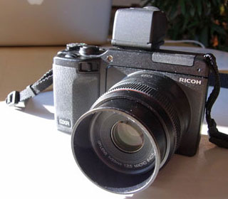
Figure 1: My digicam has the "full press snap" feature
Most compact digicams use a contrast detection autofocus system, which is far too slow for moving objects like small kids: Before the autofocus has settled, the precious moment is over. As a solution to this issue, FPS does the following: If you depress the shutter-release button fast autofocus is overridden and the much faster fixed focus, called "snap" focus, is used instead. The camera focuses at a preset distance, typically 2.5m, but you can change the preset any time. Thus, FPS is handy for street photographers and anyone who wants to take photos fast.
What is the issue here? The issue is that people tend to press the shutter-release button too fast – often without noticing it – so that snap focus takes over and sets the focus distance to 2.5m. In many cases, fuzzy images result because the target is at a different distance. As the camera does not provide any clue that autofocus has been overruled, users are puzzled by the poor automatic focusing behavior of their cameras and rack their brains to find out what happened. Some users, like me, engage in extended experiments (in my case, the issue was confounded with another one...), others consult discussion forums, as one user did just recently after two out of three portrait shots had turned out fuzzy, and some users may never arrive at the correct explanation.
The professional photographer mentioned above is right: These users do not know their cameras. Either they did not read the manual, overlooked the feature there, did not take the information seriously, or forgot it because FPS is a rarely used functionality for most people. Consequently, it will not be included in their conceptual or mental model of how their camera works. They will brood and brood and not arrive at a correct explanation without studying the manual or getting external help.
Should these "dumb" users be rightfully punished for their ignorance? As a user advocate who, of course, includes the dumb users, I would say no and claim that devices should be delivered in such a way that they work "safely" and "as expected" by default. Here, however, we encounter an "unexpected" and "hidden" behavior of a device. The dialog principle of "conformity to user expectations" implies that advanced and "unexpected" features and behaviors should be turned off by default. First and foremost, we have to obey the greatest common denominator among users – and these are the users who do not read the manuals... Users should be required to actively turn on advanced features like FPS when they need and want to use them. In such a case, we can also safely assume that they familiarized themselves with the feature and will know how it behaves.
There is a second usability issue involved here – I would place it under the dialog principle "controllability" – which makes things even worse for "dumb" users: The camera does not indicate that it changed its behavior. Users do not seem to realize that they depressed the shutter-release button too fast and that, as a consequence, snap focus took over. They wonder what has happened to autofocus. A temporary indicator of the override in the viewfinder and LCD display would make evident what happened to users and save them from being puzzled and from fruitless brooding. With such an indicator, they could even experiment with the button.
The only other way to find out what happened is to either try to decipher unpublished manufacturer-specific EXIF data (these are data that are attached to image files), or if someone or the manual pointed you to FPS, take some shots with FPS either turned on or off. This is what the user from the discussion forum did and what finally convinced him that he had depressed the shutter-release button too fast ( he had to try it out for himself before he would believe me...).
I sent my two suggestions, turn the feature off by default and indicate the override, to Ricoh and also published them on my Website. However, as a prominent professional photographer has a different opinion on this issue, I have little hope that Ricoh will implement my proposals and support "dumb" users... By the way, this professional photographer somehow reminds me of developers who blame software users for errors and regard them as stupid... And last but not least, the fact that two ISO dialog principles were a helpful guidance in this issue comforts me as a usability professional.
References
- ISO ISO 9241-110 Dialogue principles: Conformity with user expectations, controllability
April 13, 2011: UI Guidelines Are a Developer's (or UI Designer's) Best Friends!
This blink is a little different from my previous ones. This time, I am not going to tell just another story about how I struggled with a quirky user interface. Instead, I would like to spread some propaganda about a topic that is not much in the limelight in times of joy and fun: UI guidelines.
We all know that UI guidelines do not enjoy the best reputation. Some developers regard them as limiting their creativity, others as too rigid, and still others as often incomplete or even as unusable. Moreover, some developers regard UI guidelines people as police officers who point to every error in the user interface and punish it merciless. But while some developers definitely have a negative image of UI guidelines – and often include the people who create them in this "love" – UI guidelines can also be seen in a much more positive light. And this is what I would like to point to in this UI Design Blink.
Over the years, I have written numerous UI guidelines myself, but I was never interested in hairsplitting debates and dry details. Instead, I regarded guidelines as an educational tool and as a support for developers and UI designers. And, as I have learned from the feedback given by many developers, this is just what they expected from us as usability, and later, user experience people.
Of course, the best thing would be for UI guidelines to already be integrated into the tools for developing user interfaces so that developers would not need to bother with them. This approach has been implemented to varying degrees in existing tools, but it does have its limits. When UI guidelines are built into tools, they can typically only be assured at a "syntactic" level. That is, the controls may be implemented seemingly correctly, but they may not make any sense at all if they are the wrong ones for the usage scenario at hand.
"Semantic" rules are, however, much harder to implement. Let me illustrate this with a simple example, irrespective of whether this issue has already been solved in some tool or other. If users are required to make an alternative choice (also called single selection), radiobuttons are the correct implementation in the user interface, whereas checkboxes should be used if multiple choices are allowed. A tool would primarily ensure that the controls are implemented correctly, that is, that you can select only one radiobutton at a time and several checkboxes at a time – and not the other way round. However, how can the tool know that an alternative or a multiple choice is required by the user? The only way would be to introduce a "meta level" at which the tool asks the developer which kind of choice is to be implemented and thus takes away the choice between radiobuttons and checkboxes away from the developer.
Figure 1: This UI looks fairly correct from a syntactic point of view, but not from a semantic one...
Not every developer likes a tool that deprives him or her of design choices. Some creative developers might even ask why UIs should conform to UI guidelines at all, because, they argue, they restrict the developer's creativity and do not let him or her choose between, say, checkboxes and radiobuttons (a view I once heard from a developer who felt that the former "looked better"). The simple answer is that we are obliged to make life easier for users. I could "threaten" developers and UI designers with ISO norms, which require UIs to conform to the users' expectations, be self-explanatory, consistent, and easy to learn. "Creative" UIs definitely do not conform to user expectations. On the contrary, they tend to puzzle users. Instead of ISO norms, though, I have consolation to offer for developers: Consistent UIs make life easier for them, too, by helping them learn faster how to build good UIs. This could even mean that the day will come when they know all the rules by heart – thanks to the consistency of the UI guidelines – and may no longer need to bother with UI guidelines...
All in all, borrowing the movie title "diamonds are a girl's best friend," I would definitely subscribe to the view that "UI guidelines are a developer's (or UI designer's) best friends" when it comes to building user interfaces: They make life easier for both users and developers.
April 12, 2010: Missing and Misleading Error Messages at a Bank Statement Printer...
A rule for good user interfaces is to design applications and Websites in ways that errors cannot occur, instead of remedying bad design through carefully crafted error messages. However, there will always be cases in which errors happen. Here, we are at a point of decision: Should we still stick to our strategy of not sending error messages and treat the error secretly – or should we send such messages and if so, should we inform the users about what has really happened? In the following, I will present an example that shows where the developers opted to baffle users.
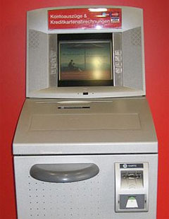
Figure 1: A similar bank statement printer (from Wikipdia, adapted)
On a recent Saturday, meaning the weekend for banks, I went to the post office and then to the bakers'. On my way to the bakers', I passed my bank and thought that it would be a good idea to stop by the bank statement printer (BSP) and have my bank account data and my credit card account data printed. First, I inserted my debit card into the machine and was somewhat puzzled that even after some fiddling around I was not offered the choice of printing my account statements – all I was offered was to read my account data on screen. Already somewhat disappointed, I inserted my credit card into the BSP, expecting it to print out my account data. However, that did not happen: Instead, the machine told me that this was not applicable to my card. Now, I was even more confused and inspected the machine, asking myself whether it had been exchanged or altered. The machine had the opening for taking out the bank statements – it seemed to be the same. Particularly, the credit card message puzzled me: I had inserted the card into the machine countless times before and the card had always been accepted.
Somewhat frustrated, I went home, and when I passed the bank the next Monday, I decided to ask the bank clerk why my card was no longer accepted by the BSP and why it would not print account statements any more. However, as I had already asked the clerk a lot of strange questions in the recent past, I hesitated bothering him once again and decided to give the machine another try first. And voilà – this time, everything worked as expected.
Now the scales fell from my eyes: The BSP had simply run out of paper during the weekend. But why on earth did the machine not tell me that? Instead, it simply discarded a choice – printing account data – without warning and also presented a completely misleading message for my credit card. Obviously, the logic behind the message was that as all the machine can do with my credit card is print an account statement, my card was no longer "applicable" when the machine had run out of paper. But admittedly, that's queer logic which forces users to think outside the box. A message telling me that the machine had run out of paper would have made the situation much more transparent – but would, perhaps, not be very favorable for the bank...
All in all, depriving users of choices without any comment and sending them misleading messages instead of telling them what really has happened is in my view not user-friendly, to say the least. Hopefully, other users are more alert than I was when they encounter the same situation...
March 30, 2011: Enriching and Not-So-Enriching Complexity
In his Interactions article, Simplicity Is Not the Answer, from 2008 (also found on his website, see below), Don Norman highlights that complexity is an ingredient of our world and enriches it. He emphasizes that any interesting product mirrors this and has an inherent complexity. In his new book, Living with Complexity, from 2010, he adds that it is complexity that makes things interesting for us. He also points out that most of us prefer a "medium" level of complexity – too low means dull, too high means overwhelming and frustrating.
While I agree with Norman that complexity enriches our lives, I claim that some of the complexity therein, and particularly the complexity of the tools and devices that surround us, is artificial, unnecessary, and – more or less – unwanted, at least in the long run. Norman would probably agree and would attribute the unwanted complexity to bad design: However, bad design has many causes, and many of them have little to do with designers lacking ability. Often, unwanted complexity is there for purely technical, economic, or "Zeitgeist" reasons, and all of these can form unholy alliances. For example, nobody cares for "good" design when well-designed products look old-fashioned or ugly, appear to us as deprived of features, or are simply too expensive. Such trends can, however, be reverted, as the current hype for retro designs indicates. Clever marketing can indeed effect a great deal.
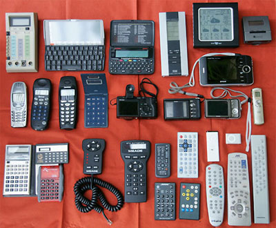
Figure 1: My own collection of remote controls, devices – complexity enough...
Much unwanted complexity invades our lives because humans have certain characteristics, preferences, and weaknesses. For example, many of us tend to buy the product that has the longest list of features – carefully prepared by the marketing department to lure us into buying. When I put too much food on my plate and could not finish it off, my mother used to say that my eyes were larger than my stomach – similar things could be said about our buying behaviors. We also buy products because others have bought them or because they are "in" at the moment. Later, we discover that they are cumbersome to use, do not fit our needs, or that we don't need them at all. Nevertheless, we fill our houses with all this unnecessary and later even unwanted stuff, further increasing the complexity of our personal environment. On the other hand, trends like "simplify your life" attempt to counteract and fight complexity in our lives, indicating that many of us are overwhelmed by it at times.
All in all, the complexity that surrounds us is not always perceived as enriching. Poor or, at least, suboptimal design choices are made for a number of reasons, and, last but not least, it is we who increase the complexity in our lives by making poor buying decisions and by preferring and economically supporting mediocre or even inferior solutions. Thus, if Norman concludes that design [comes] to the rescue, I would like to add that this is an incomplete view of the whole story: Human preferences and weaknesses, technical and lifestyle trends, and economic considerations are further players in the "complexity" game. Hopefully, we can muddle our way through successfully and achieve an optimal "medium" level of complexity in our lives...
References
- Don Norman: Simplicity is not the Answer
- Donald A. Norman (2010). Living with Complexity. The MIT Press • ISBN-10: 0262014866, ISBN-13: 978-0262014861 • Review
March 10, 2011: The Plagues of Modern Times (1) – Online Software Updates
With this UI design blink, I would like to start a loosely coupled series of blinks under the motto "The Plagues of Modern Times." In my first blink about this topic, I present a plague that continuously annoys me: online software updates.
Every computer user who is connected to a network (and who is not these days?) has probably had the following frustrating experience: You start an application on your computer to do just one "small thing" – it's only a matter of minutes or even seconds. But instead of taking you straight to your task, the computer asks, or even urges, you to install the latest updates from the Internet for the application you just launched. Arrrggghhhh!!! The last thing that you want at this moment is to wait for an uncertain – and often undisclosed – period of time to perform an update that possibly involves a system restart as well.
Although only rarely does the computer force me to perform the update, my problem is that I usually – grudgingly – do it for a number of reasons: In some cases (antivirus and protection software for instance), the computer bugs me so much that I "voluntarily" install the update. In other cases, I simply feel obliged to install it to make the system more secure and stable, and "the world a better place." And I also tend to think: "I'd rather do it now than at a time that's even more unsuitable."
If I am lucky, the update process finishes quickly, but often it may take anything from a couple of minutes to, as I have experienced, half an hour or even longer. On "off days," the update even entails further updates, increasing my waiting time and frustration. I can only hope that after the updates I will still remember what I actually wanted to do when I started the application...
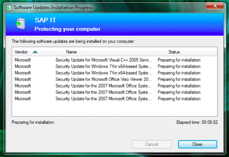
Figure 1: The first thing that my computer did, after I had updated to Windows 7 was to update Windows 7 and Office
All in all, by squeezing in updates to be installed from the Internet, the computer moves me from a "just quickly" to a frustrating "wait and see" mode.
Here are a few examples from my own experiences – you can probably add a lot more:
- My wife once wanted to start a presentation that she had received via e-mail. What she got was a Microsoft Office update that took more than 10 minutes. Afterwards, her interest in the presentation had vanished.
- I wanted to quickly enter my working times into the system, but the system proposed to perform a SAPGUI update first. At least, I could reject the update. Usually I enter this data just before I go home, and an update that forces me to stay longer at the office is less than welcome.
- I have an Apple computer at home and run Windows on a virtual machine. When I start up Windows after a period of not having used it, the antivirus software regularly prompts me to update it. Depending on the antivirus software, an update can take quite a while and slow down my pace considerably.
- Updates that are performed at system shutdown can also be frustrating because you want to do something else, go to bed, or whatever after shutdown. For example, when I shut down Windows XP, I repeatedly have to install system updates. Once I had to install 14(!) updates because I had not used Windows for quite a while – this is probably meant as a punishment for not using Windows regularly...
- On my Mac, the imaging software DXO and Parallels Desktop, a virtual
machine for running Windows, are typical candidates for update requests
when I start them. In addition, from time to time, Mac OS X itself brings
up a dialog and invites me to perform updates of system or Apple software,
including applications like iTunes and iPhoto that I rarely or never
use and that typically involve downloading lots of megabytes...
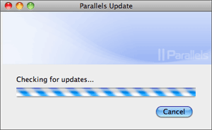
Figure 2: Parallels Desktop checking for updates
In many cases, I can start working while the updates are being installed, but the update may slow me down or disturb me with popups that require my attention. In some cases, the updates also require me to close certain applications – I can bet that these are just the ones that I wanted to use while the update is going on. Finally, some of the updates require me to restart the computer. So I need to save all my data, and my work is interrupted for several minutes (in some cases I can delay the update, but I rarely do so...). Some software updates even enforce a restart – hopefully I can manage to save my data in time and do not hit any wrong buttons in my panic...
The update plague is even more severe for casual users than for regular ones. Firstly, as they use certain applications or systems rarely, the chance that an update is needed is high. Secondly, they are also the kind of users who want to be blocked by the computer the least – they just want to do something quickly, but the "mean" computer upsets their plans...
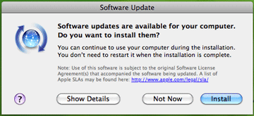
Figure 3: One of the popups that I hate most on my Mac – Mac OS X signals that updates are available. At least, no restart is required this time.
As most software companies have been infected by the "frequent online updates" disease instead of delivering updates at regular intervals (half a year or a year), as was the case some years ago, the update plague has spread like fire. On a computer with a larger number of applications, the probability is high that users have to install updates daily, particularly if antivirus software is installed on the computer. "Give us today our daily update," one might be tempted to say. I would actually prefer it if my time were stolen by updates at longer intervals, for example, only once a year...
March 8, 2011: A Clash of Conceptual Models Leads to Credit Card Hassles...
Don Norman spends a lot of time talking and writing about conceptual models (see references for examples). Until just recently, I did not pay much attention to them, although I am well aware of the fact that developers and users think differently. The following episode, however, brought me into direct contact with them.
Some days ago, I found an e-mail from clickandbuy in my private e-mail inbox. It said that I should update my credit card data because the card would expire soon. So I went to their Website, logged on to the customers' area, and, following their instructions, navigated to the settings for the payment method. There, my old credit card was listed, and I clicked the "Ändern" (Change) link in order to edit the card's data and change them to my new card's data. However, on the screen that was then displayed (see figure 1 below), the card's type and number were set to read-only – I was only allowed to change the expiration date, the card security code (CVC), and my address data.
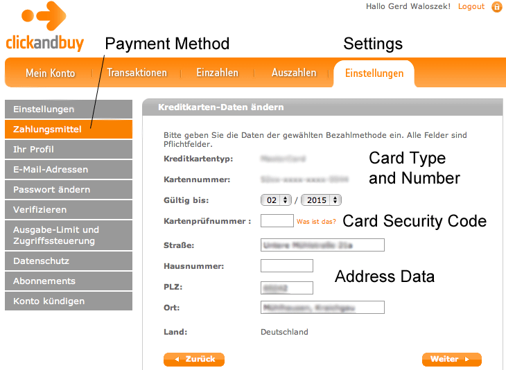
Figure 1: The screen for changing credit card data
"OK," I thought, "they want me to enter the CVC first as a security measure. Then I can click 'Weiter' (Continue) and change the remaining data." But now I was in real trouble: Two months ago, the credit card company had announced that it would block my credit card for undisclosed security reasons in the near future. Therefore, I had asked my bank to block the card immediately to prevent any misuse of my card data. I had also handed the card over to the bank as it was no longer needed. Oh my god, neither had I written the CVC down, nor could I remember it now – but without CVC I was surely stuck. And indeed, I was stuck not only on this screen, but also by going down the wrong path, as I would soon learn…
Consulting the help screen did not get me any further. In my frustration, I clicked around a lot and finally had the idea of simply adding my new credit card to the list of payment methods instead of changing the old card's data. I succeeded in adding the new card to the payment methods, and now two cards showed up on the initial settings screen for the payment methods. And that wasn't all: a new link appeared that allowed me to delete my old credit card (see figure 2), which wasn't possible before. Thus, as soon as there are two payment methods, either of them can be deleted. However, one of them has to remain because you cannot delete a payment method as long as there is only one. This became evident as soon as I had deleted my old credit card (see figure 3). (Moreover, I had to laboriously confirm all these changes afterwards...)
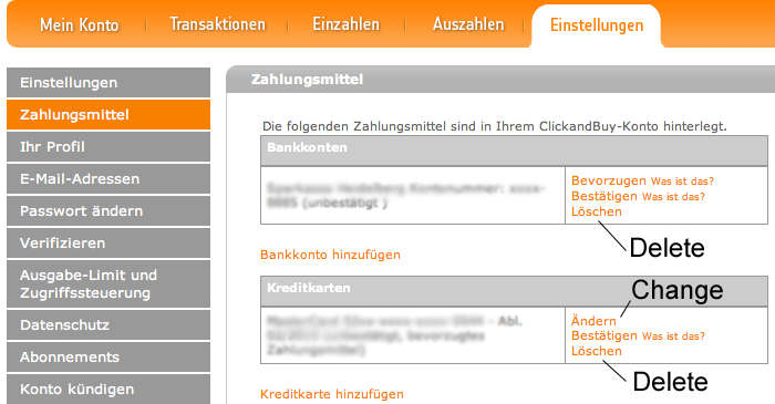
Figure 2: If there are two payment methods, you can delete either of them
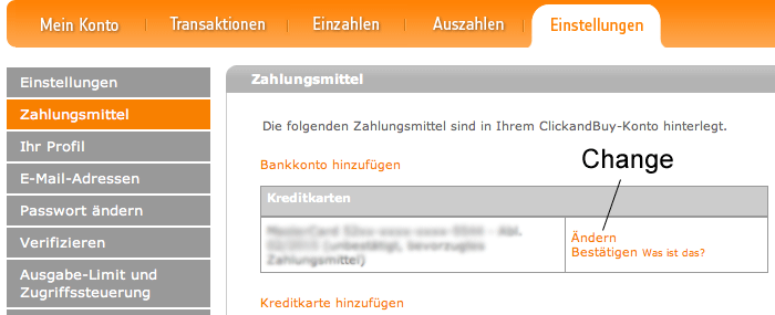
Figure 3: If there is only one payment method, you cannot delete it. You can change some of its data, but you cannot change an old credit card into a new one.
I realized that my initial assumptions about how credit card data can be changed on this site were wrong. Contrary to what I had expected, once a credit card has been added to the site, you can no longer change its type and number. To make such changes, you have to add a new card first and then you can delete the old one – just as I had tried out as a work-around. But actually it's not a work-around at all, it's the way you have to do it on the clickandbuy site.
Stepping back, I realized that my failures and wrong assumptions were the result of clashing conceptual, or mental, models. My primitive mental model suggested that I can simply change a card's data to the data of another card and that's it. Such a change may, however, leave the system in an inconsistent state, especially if I enter wrong data. As an SAP employee, I should have known that a system with a database in the background always has to be in a consistent state. The developers of the clickandbuy site solved this dilemma by locking the main credit card's data once it had been entered correctly and by keeping one payment method "alive" all the time. They could have handled it differently, of course, but they didn't. All in all, there is logic behind the site's behavior, but obviously the developers' and my initial conceptual model were incompatible, until I gradually learned and adopted theirs… (To sum up, on the screen shown in figure 1, you can only change the data that are open for editing. As I found out later, the "Weiter" (Continue) button simply returns you to the selection of payment methods, which is the initial screen for setting payment methods.)
However, all this begs one final question: Why on earth can't clickandbuy tell the users of its site – at least in the help section – that when their credit card has expired, they should add a new payment method first, and then delete the old one??? This would have saved me a lot of time, particularly the time that it took me to write this article...
PS: There may be cases in which, after a card has expired and is replaced by a new one, its number (and type, of course) stays the same. Does anybody know more about this?
References
- Don Norman: Design as Communication
- Don Norman: Affordances and Design
- Don Norman: Affordance, Conventions and Design (Part 2)
February 2, 2011:The Blessings of Auto-Complete
Has this happened to you, too? You find some strange e-mail in your inbox from someone that you know and you wonder why on earth you received it. For example, I exchange a lot of e-mail with my brother. One day, however, I received an e-mail that was directed at his team at the university where he works. I was puzzled and asked myself why I had received the e-mail and what my brother wanted to tell me with it. When I sent him a "???" reply, he responded that I had received the e-mail in error. Needless to mention, this pattern repeats from time to time.
In the meantime, I know why I had received those e-mails, but before I disclose my secret to you, I will tell you one more story along the same lines. This time, I was the one who sent an e-mail erroneously to the wrong person. I became aware of this only two weeks later when I received an e-mail from a colleague. In his e-mail, he noted that he was quite impressed that we use knife rests at home (see photo below). He also added that in such a case he would expect us to also use underplates, which we obviously did not. After having recovered from my initial bafflement, I realized that I had sent him an e-mail at Christmas showing our Christmas meal and containing some private information that I intended to send to my brother and his wife. However, in one case, a wrong receiver address had been entered – not by me, by auto-complete. After I had typed the first two letters of the e-mail address, the auto-complete function had caught up (after an initial delay) and had supplied the most probable address – which was regrettably the wrong one in this case. Probably, I will have detected some movement in the periphery indicating that an address had been inserted successfully. But I was not aware of that there was a choice of addresses and that a wrong one had been inserted. So I had not looked at the URL row carefully – with the result I just described...

Figure: The knife rest...
Now, we can also deduce how my brother's erroneous e-mails reached me: "thanks" to auto-complete! One of his team member's e-mail address starts with the same letters as mine, as both of us have the same first name. We can also conclude that my brother did not check his receivers list properly – probably because he was in a hurry...
In the cases described above, auto-complete helps people like a boy scout who guides an old lady across the street although she does not want to cross it. There are also cases, in which auto-complete helps users but they do not take advantage of its assistance. For example, I found that my colleague who is a fluent typist typed a URL that she was not quite sure about into the browser and did not realize that the browser had already completed the address correctly. So she continued to type and started to flounder because she was unsure of the exact address. Being a good typist, she did not look at the keyboard, but she also did not look at the URL row, which was fairly high up on the screen. She must have been gazing somewhere into nowhere land in the middle...
Back to the bad typists, that is, to me. As a two-finger typist, I hit wrong keys fairly often – URLs are no exception to this. This leads to the fatal result that the browser stores the wrong spellings and afterwards completes my URL entries with a misspelled one. To get through to the correct URL, I have to enter nearly the complete address. This is of no help at all, particularly because of the confusing interruptions by the auto-complete functionality. By the way, does anybody know how to clear the auto-complete from unwanted entries? Deleting single entries would be the best!
All in all, we find that even a functionality that is meant to help people can lead to the opposite. Users are as not cooperative and do not act as one would expect from them; in particular, they do not look at the screen carefully enough. Thus, innovative ideas are needed that help auto-complete to cope with user exemplars like me – or are we even in the majority???
Here are some responses from colleagues:
One colleague wrote:
- To delete URLs with incorrect spelling from AutoComplete in Internet Explorer, go to Safety > Delete Browsing History…
- In Outlook, the way you delete individual entries depends on your version of Outlook (call help and enter AutoComplete as search string).
- In Office 2007: In the AutoComplete list, select the unwanted name by using the <UP ARROW> or <DOWN ARROW> key and choose the <DELETE> key. For other Office versions, an Internet search with appropriate search terms provides useful results.
Another colleague wrote:
- Here are your contemplations on the perils of auto-complete. I, too, have learned to be very careful with auto-complete after a few embarrassing e-mail incidents.
- I moved last year, and many Websites where I have to enter my address still keep giving me my old address (and in some cases, they spell many name incorrectly because I was sloppy when entering it for a flight booking 2 years ago). Lufthansa now thinks my name is Peryr.
- Your article inspired me to dig through the help section for Firefox,
and I found that you can delete individual auto-complete entries. I think
the same procedure also works in IE.
http://support.mozilla.com/en-US/kb/Form%20autocomplete?s=forms+entry&as=s#w_deleting-individual-form-entries
Last Revision: 03/21/2014
|
Gerd Waloszek |
made by |
 on
a mac!
on
a mac!